Company:
City of Oroville
Year:
2026
Duration:
6 Months
Overview
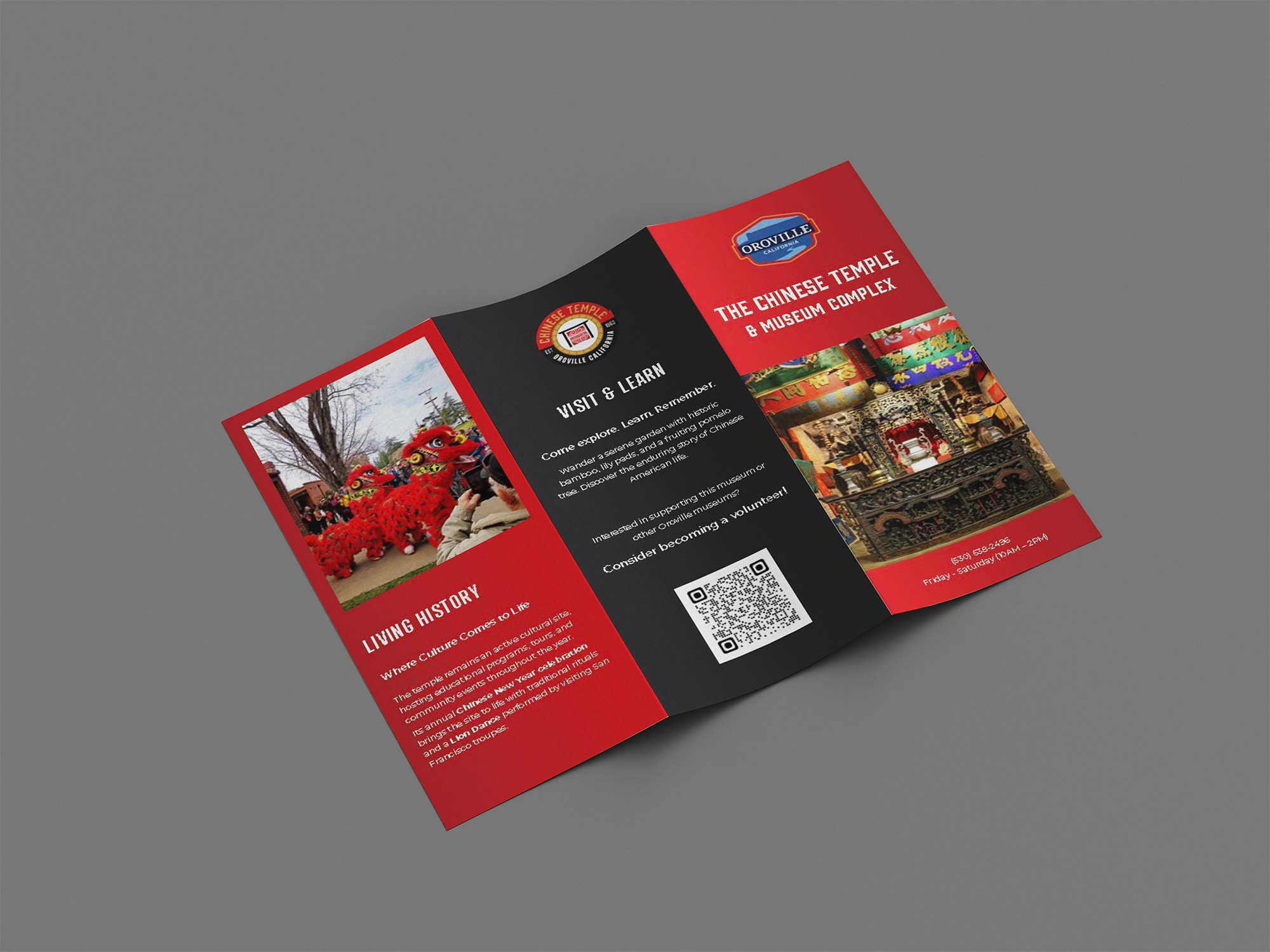
A branding and print redesign project developed for the Chinese Temple of Oroville, focused on improving the clarity and visual engagement of existing informational materials. The goal was to create a more accessible and cohesive design system that would better connect with a broader audience while respecting the historical and cultural significance of the site.

Problem
The existing print materials lacked visual consistency and clarity, making it difficult for visitors to quickly engage with and understand the information being presented. The challenge was to redesign these materials in a way that improved readability and structure while maintaining a respectful and appropriate tone for a historically significant cultural site.
Solution
To solve this, I developed a clean and structured layout system that prioritized hierarchy, readability, and visual balance. Typography and spacing were refined to guide the viewer through the content more intuitively, while a restrained visual approach ensured the design remained respectful to the cultural context. The updated materials create a more cohesive and engaging experience, making the information easier to navigate and understand.